Tracking the Coronavirus Around the U.S.
![]() More than 47 million people in the U.S. have had confirmed coronavirus infections and more than 770,000 have died of COVID-19. Thousands of new cases are reported daily nationwide. Explore the trends in your state or in a state that you may be visiting during the holidays. View the data via a heat map, curve charts, a table of state-by-state trends over four weeks, or a map of total cases and deaths.
More than 47 million people in the U.S. have had confirmed coronavirus infections and more than 770,000 have died of COVID-19. Thousands of new cases are reported daily nationwide. Explore the trends in your state or in a state that you may be visiting during the holidays. View the data via a heat map, curve charts, a table of state-by-state trends over four weeks, or a map of total cases and deaths.
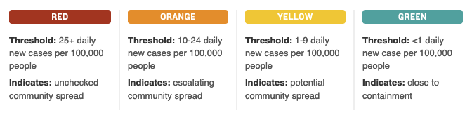
Using a familiar green, yellow, orange, red color scheme, the heat map shows the risk of infection in each state based on new daily cases per capita. The consortium of researchers and public health experts who developed these risk levels advises states in the red category to issue stay-home orders. Orange states should consider stay-home orders, along with increased testing and contact tracing. Yellow states need to keep up social distancing and mask usage, and all states should continue testing and contact tracing.
Excerpted from “Tracking the coronavirus around the U.S.: See how your state is doing” from NPR. View the data online. Data is updated every Monday and Thursday.
Source: NPR | Tracking the coronavirus around the U.S.: See how your state is doing, https://www.npr.org/sections/health-shots/2020/09/01/816707182/map-tracking-the-spread-of-the-coronavirus-in-the-u-s | © 2021 npr
Do you need someone to talk to? To schedule an evaluation or to get advice about your child’s or teen’s challenges, call or email a CHC Care Coordinator at 650.688.3625 or careteam@chconline.org CHC teletherapy services are available now.
You might also be interested in:
-

We Can Do This is a Department of Health and Human Services COVID-19 public education…
-
You're busier than ever and feeling the pressure. In times like these it’s important to…
-

The UCSF Collaborative to Advise on Re-opening Education Safely (CARES) offers timely guidance and a…